A best practices credit union rebrand case study showing how the financial institution leveraged their influence and identity to appeal to a new generation of CU members
For the past eight decades, Montana Credit Union has been known as the place to bank in and around Great Falls, MT. But as local demographics and business demands began shifting, the financial institution needed a more modernized approach to reflect those changes and spur more growth. With an updated charter that supported a physical and service-side expansion, the credit union partnered with Adrenaline to develop a new identity that would reflect where the financial institution would be heading for the next 80 years and beyond.
Expanding Membership
Montana Credit Union had a very large amount of their current membership base in older demographics, with the majority of members above 50+ prior to the rebrand. With a goal to appeal and attract a younger demographic without alienating the current membership, the rebrand would need to feel fresh and familiar at the same time.
Market Measures
With only three branches, Montana Credit Union has a surprisingly outsize presence in Great Falls. The credit union has the benefit of having an influential name that gives the perception of large market share to outside audiences. To ensure a prosperous future, the credit union needed to leverage the benefits of their brand name while streamlining the moniker so they could attract younger audiences to their institution.
Financial Future
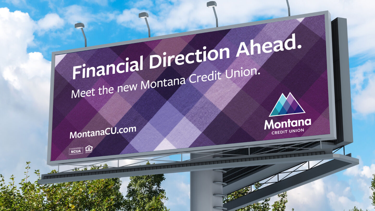
This two-year rebranding effort included dropping “Federal” from the name, changing the overall identity, adding the tagline “Guiding You Ahead” and ultimately giving credit union employees more resources, tools and support for them to help educate and guide members toward their financial futures. The intricate, mountain-themed logo mark and refined Montana typeface conveyed the more modern approach which is communicated both at first glance and as members dig deeper into the credit unions Big Sky Country values.