A custodian of community trust for over 80 years, Greater Philadelphia’s Citadel Credit Union strengthened and refreshed its brand to meet the moment
At the internal launch of Citadel Credit Union’s refreshed brand identity, President and CEO Jeff March spoke to employees affirming, “This is not about fixing what is broken, but about amplifying and scaling what is working.” Building on the success of a local institution that has been the custodian of community trust for more than 80 years, Citadel Credit Union’s brand reflects its past strength and its origins borne of serving Lukens Steel Mill workers and their families, all while capturing the energy and vision of new generations and the promise of what’s to come.
One of country’s top-60 largest credit unions with more than $4 billion in assets, the regional financial institution successfully serves the Greater Philadelphia Area with 24 branch locations in southeastern Pennsylvania. Previously working under the singular moniker Citadel, the credit union had chosen to operate with deliberate ambiguity regarding its service category, focusing more for customers and potential customers on the banking services it provided than in claiming its credit union standing. With the refreshed brand, Citadel Credit Union now wears its non-profit, credit union status loud and (Philly) proud.
We are the unshakable promise to serve those who work every day to build a better future for us all.”
Planning for (re)Brand
Brand represented a significant strategic business priority for Citadel Credit Union, focusing on getting to greater growth without sacrificing any brand equity or what makes the brand distinctive. The rebranding effort was never about fixing a broken or tired brand, but about refreshing and refocusing an already relevant brand, not renaming it. To that end, the name would remain – a strong foundation from which to build.
Branding efforts would center around thoughtfully updating Citadel Credit Union, so it would be a more resilient, resonant brand, now and into the future. A refreshed brand and platform would provide even more gravitas as Citadel reaches deeper into existing markets and broader into new ones, increasing brand equity and awareness in core service areas. While elevated, the brand would be accessible and understandable for members, potential members and the communities Citadel serves. The benchmark for success would be unaided awareness, leading to consideration and purchase, and ultimately advocacy.
Industry Implications
Knowing that financial services don’t exist in a silo, Citadel Credit Union’s stakeholders understood that consumer demand outside of financial services is setting expectations from within. Customer experience (CX) and user experience (UX) are key drivers of innovation across every industry, accelerating disruption and demand for innovation, regardless of service sector. Another key insight influencing the credit union space is customer satisfaction, which for the first time, finds credit unions equal to banks in key metrics. In short, consumers have positive associations with what a credit union can uniquely provide, and people recognize all the benefits associated with not-for-profit institutions compared to shareholder-owned banks.
Through our research, we came to the realization that embracing our roots as a not-for-profit credit union tightly aligned with the needs of our members, the communities we serve, and then positioning of Building Strength Together.”
– Jonathan Georgopulos, Vice President of Brand & Buzz Citadel Credit Union
Brand as a Beacon
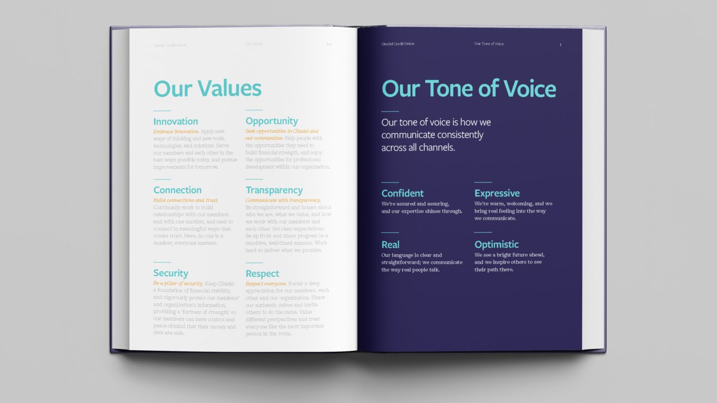
Citadel Credit Union’s brand is built on a strong platform that guides everything the organization does. This mission-oriented brand is a confident, optimistic partner to its members and the communities it serves. Its values include innovation, connection and respect, and its brand position, Building Strength, speaks to a momentum rooted by enduring strength, a focus that’s as actionable as it is aspirational. With a purpose focused on helping people prosper, the brand is a solid, sturdy foundation upon which brighter, better futures are built.
Brand building is a process that starts like all effective design processes by assessing a situation and deciding where and how to make it better.”
– Daniella Deal, Creative Director, Citadel Credit Union
The brand’s original name already came from a position of strength, so it didn’t need a reintroduction, just a repositioning. The word Citadel is defined as a place where people can gain strength for a better future. Embracing “credit union” as a central part of its identity by adding it to the name, the brand makes a promise that as a not-for-profit financial institution owned by members, it’s deeply rooted in the community where people are helping people. This kind of purpose-driven brand is perfectly positioned to meet the moment.
Story and System
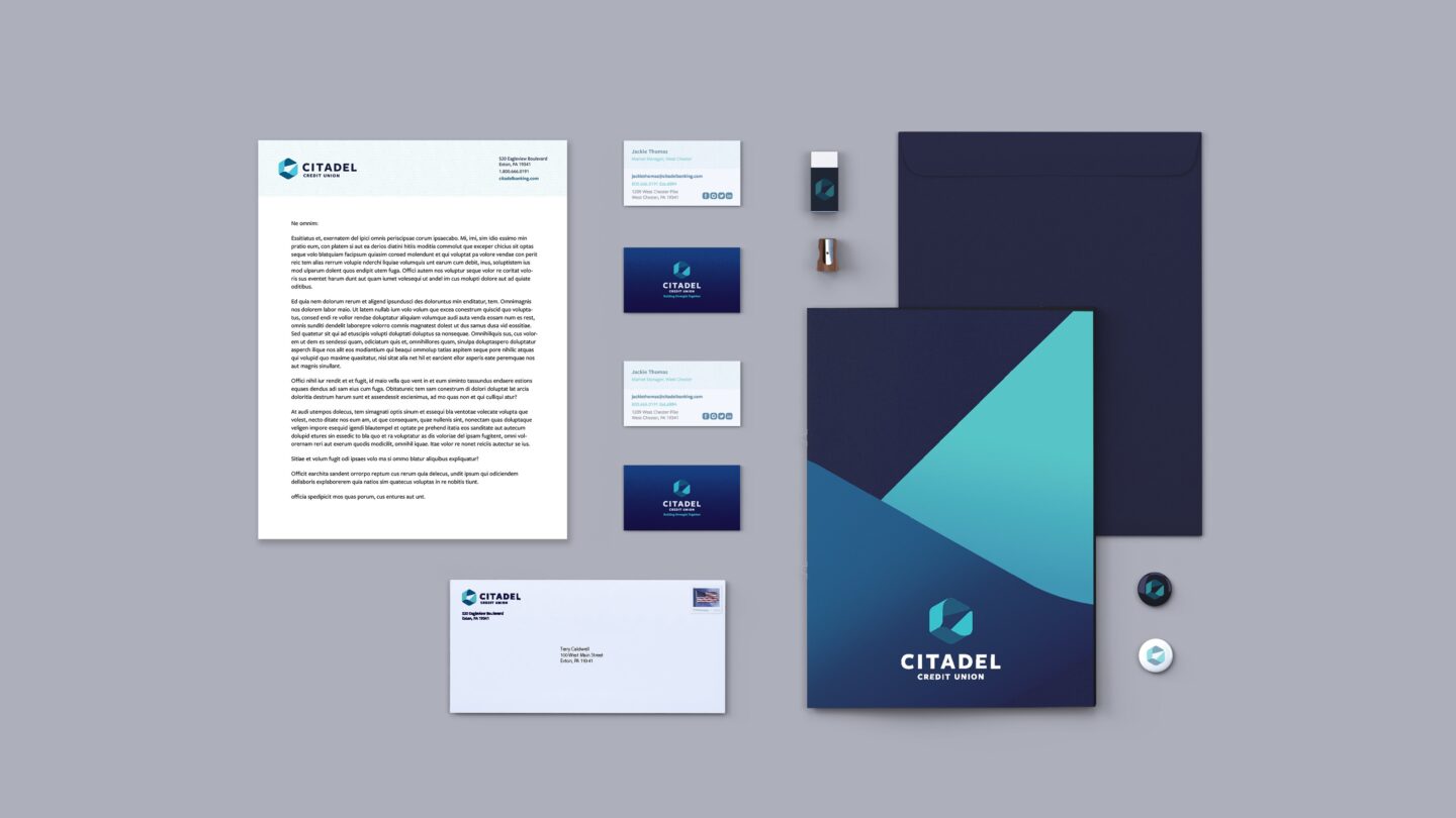
With a strong foundation in place, the team set about developing a strong story arc, and a system of assets for expressing the brand in a meaningful way. The logo was the linchpin of the visual iconography that would powerfully represent the brand across platforms – a modern Citadel, a source of enduring strength and forward momentum. Its hexagonal shape is grounded by one of nature’s most stable geometric forms, rooting the brand in a foundation of strength and trust. The new tagline, Building Strength, speaks to that balance of stability and progress Citadel stands for and is a direct reflection of their brand positioning – an internal idea that gets expressed externally.
The visual identity system is an ongoing refrain on the same themes throughout – foundational strength and forward movement. With a color palette that is rich and a pattern language that’s constantly in motion, it’s an endless source of energy, moving the brand and the people it surrounds ever onward. With imagery that celebrates the Philly-proud people Citadel serves, collateral displays authenticity through a photojournalistic lens, highlighting lifestyles that reflect real people, while envisioning an aspirational shared future.
Audience and Alignment
The brand serves a diverse base in Greater Philadelphia, so brand positioning needed to speak to numerous audiences at once and be both intuitive and accessible. With grounding in brand strategy and a keen eye on brand equity, Citadel Credit Union needed to first and foremost leverage the power of its internal advocates. With an employee-first launch, there would be an opportunity for employee input and buy-in, moving next to members and finally to full market presence and delivery, all with internal advocacy to fortify and forward the new brand. The team developed and delivered brand messaging in four phases: a seeding campaign (Mar-Aug); virtual launch to employees (Aug); member/public launch (Aug-Sep); and advertising campaign/updated signage (Sep forward).
Launch Logistics
While the Citadel family couldn’t be together in person, a virtual branch launch provided leadership with real-time feedback and an opportunity to capture the enthusiasm of the whole team via an ongoing stream of gifs, emojis and comments. This provided Citadel Credit Union a sense of shared excitement across the organization – a true rallying cry for employees, members and ultimately the market.
Foundation for the Future
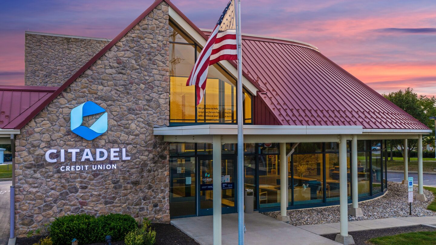
Immediately following the launch, updates to interior and exterior signage began across the network, creating a consistent and cohesive rollout. In each branch, the Citadel Credit Union brand promise will take center stage in big, bold letters for all to see. With being a credit union as a focus, the new brand positioning is set to help Citadel Credit Union to become the clear financial institution of choice in a market where people recognize all the benefits associated with not-for-profit institutions.
The best brand strategies are designed to be accessible to everyone. Our aim was to create a powerful pledge that would deepen connections with each other and our members. Through this process, we identified what to preserve and what we will build upon for the future.”
– Jeff March, President and CEO, Citadel Credit Union