How a regional credit union rebrands and reaffirms their connections to community
Valley Strong is a credit union deeply rooted in the Central Valley community in California. With a proud history rich in the region’s place and people, the former Kern Schools Federal Credit Union was founded by teachers in 1938. Today, the credit union supports members from diverse backgrounds, no longer exclusively serving only valued educators from the region. From its agricultural bounty to the energy sector, the Central Valley is a budding region where a more traditional cross-section of community members and new arrivals mix and mingle, and a younger and up-and-coming generation of Hispanic Americans is destined to make their mark.
Bearing a moniker that inherently limited their current and future scope, the credit union needed a new name and brand that would reflect their rich and rooted relationships and speak to their modern blend of members. The rebranding process began with market research, powerful intelligence and insights, and a social listening campaign to uncover what was most meaningful to the area’s residents. Nurtured throughout a year-long process, the new brand grew out of a sense of local pride of place and thrived on a strong heart for serving. This is Valley Strong Credit Union.
Cultivating a Brand
The Central Valley is home to multiple generations of farming families and newcomers seeking opportunities, as they move away from urban centers in California and toward a renewed definition of the California Dream. The new credit union brand would need to reflect a grounding in the culture and community tied to their organic place, but also welcome in the area’s recent transplants. The brand needed to feel familiar and fitting – like they had always been there – for long-time residents and new community members alike, seeking a sense of local connection with a solid financial institution.
Brands needing new names usually have a former one that’s tied to geography that is changing or connects them to a previous (and more limited) customer base they had grown past. In this case, it was both. The credit union needed to capture a bigger market share as they expanded their footprint geographically – beyond Kern County – and demographically – beyond their teacher roots. This new brand required an authentic story to tell as they move northward in the Central Valley, sowing the seeds of new relationships while keeping their legacy alive. Seeking organic growth, the credit union wouldn’t show up with massive market presence as the brand’s defining feature, but would foster real relationships instead.
Seeding Strength
Grounded by market and competitive research and augmented with social listening, data intelligence and insights provided a powerful underpinning for developing smart strategies for the brand. It uncovered a particular vernacular of the valley and revealed the ubiquity of place as a central focus for the people who live there. The member persona that came to life is one of a second generation millennial man who is proud of his hometown high-school as he works hard to make his dreams a reality. He loves where he lives and is owning his future: He is Valley Strong. The brand strategy speaks to and taps into that point of personal pride.
With a name rooted in strength, the credit union also needed an equally commanding positioning. Spotlighting “Growing Possibilities” fortifies Valley Strong’s role as a pillar of strength for their members, empowering them to make the most of their prospects and potential, planted and nourished here. The manifestation of brand represents the foundation of the American Dream, come to life in California’s Central Valley. What unfolds is not only a pride of place in the Central Valley, but a pride of place in America, a foundation of internal strength expressed outwardly. Ultimately, the brand positioning of Valley Strong’s “Growing Possibilities” is an open slate where people can write their own story.
Bearing Fruit
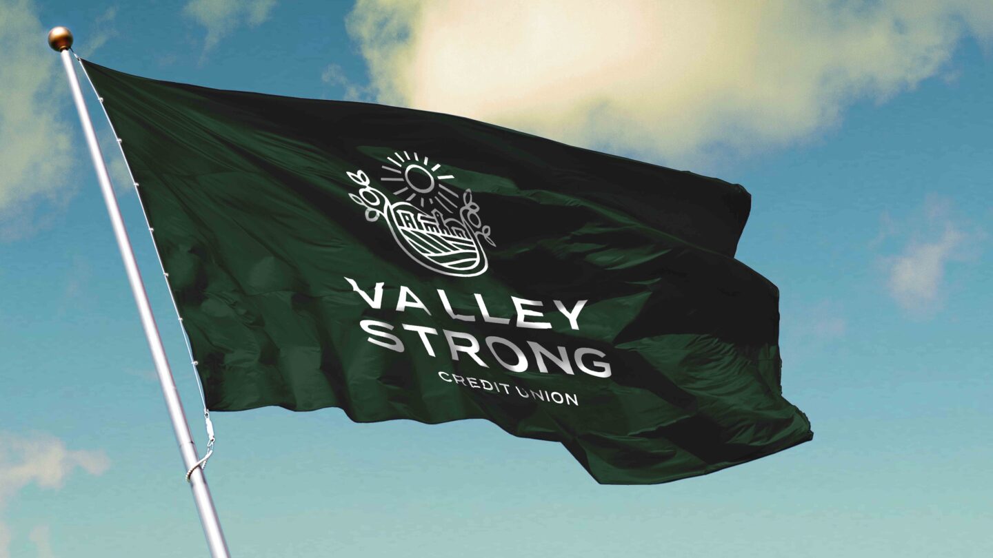
The brand identity is built upon that local pride and contained within is the community along with natural and familiar architecture. The logo contains a micro-story, incorporating the valley, the city, the crops, and most of all, the possibilities – all encapsulated inside a seal motif. An intricate pattern was also developed using the logo and applied to powerful effect, especially inside the branch environments. With a design system comprised of rich, earthy colors, lived-in textures, photography and videography highlighting real landscapes and real people from the area, it feels like something that’s always been there, but entirely fresh at the same time.
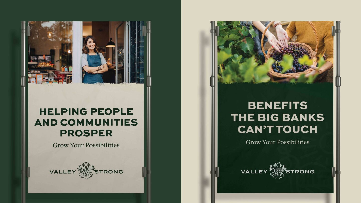
Outwardly the Valley Strong Credit Union brand expresses a rich local history that encourages and engages people in the valley’s communities to like who the brand is and where they’re going. With an outlook that is optimistic, the Valley Strong Credit Union brand signifies a focus on member growth, new possibilities and nurturing a brighter tomorrow. Growing possibilities comes from the brand positioning, but it’s really an invitation and a call to action for members. Reflecting the “Growing Possibilities” positioning internally, Valley Strong reimagined their mission statement: “We help people and communities prosper” which lives that credo out loud right on the wall of their branches.
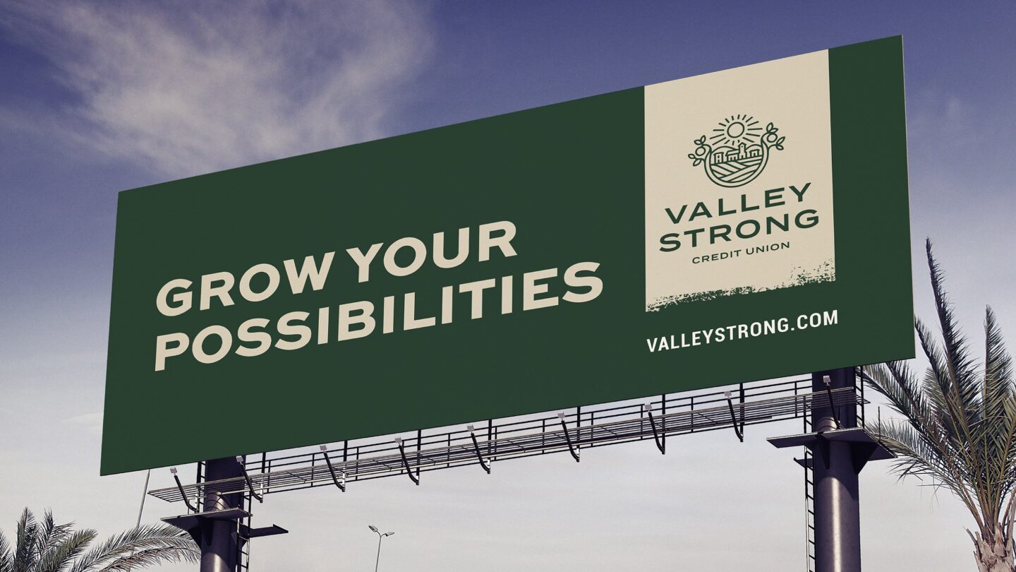
As the Valley Strong brand readied for market launch, the credit union focused their energies on their internal strength first, revealing the brand to their employees as an important initial step. Best practice in branding is an employee-first launch focused on training employees on how to live the brand and deliver on the big promise to members, and Valley Strong took up the mantle. Following the internal launch to employees, the new Valley Strong brand was then introduced to service areas with television spots, followed by a market campaign, including billboards throughout the community.
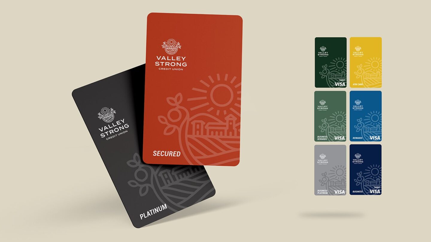
Deploying the brand in the branch environment was a complex process, calibrated and implemented based on client priorities with most of the credit union’s branch conversions taking place over one weekend. Moving the brand into the branch, Valley Strong Credit Union successfully leveraged in-branch digital to tell the story of the brand – a living expression of the brand design system – spearheading impressive implementations bringing the brand to life in the physical environment. The credit union also designed a new program for their ATM surrounds inside a very strong branded family, to ensure all brand elements are connected and cohesive.
Branches are now outfitted for multiple tiers of data-gathering, empowering Valley Strong Credit Union to deepen already strong relationships with members. Geo-fences inside pull together demographic data tied to mobile devices and a traffic monitoring system inside the branch tells the credit union where members are and what they’re doing. Virtual tracking beacons married to branch data to support an understanding of product utilization. Data also informs content deployment strategy with targeted, product messaging on in-branch digital communications. Using analytics to inform how financial institutions market at the branch level is an emerging best practice focused on a meaningful member journey inside the branch.
Growing Season
Following their rebranding, Valley Strong Credit Union is now in a place to take root and grow throughout the Central Valley region. Supported by a foundation of feedback and powerful member insights, the credit union is focused on using its brand platform to powerful effect, deepening and expanding relationships. Valley Strong was so well-positioned that the new brand was able to successfully launch to two new markets, even in the midst of a pandemic. The strong brand has now set themselves up for future growth with a meaningful promise that can be interpreted, extended and made manifest in the physical environment.
Working with Adrenaline on our rebrand has really helped us realize what’s possible for Valley Strong. We can see the full benefit of the brand strategy and platform — from digital content all the way through to the branch level — which is so critical as we expand into new markets.”
– Nicholas Ambrosini, Executive Vice President/Chief Financial Officer at Valley Strong Credit Union
Adrenaline is an end-to-end brand experience company serving the financial industry. We move brands and businesses ahead by delivering on every aspect of their experience across digital and physical channels, from strategy through implementation. Our multi-disciplinary team works with leadership to advise on purpose, position, culture, and retail growth strategies. We create brands people love and engage audiences from employees to customers with story-led design and insights-driven marketing; and we design and build transformative brand experiences across branch networks, leading the construction and implementation of physical spaces that drive business advantage and make the brand experience real. Get in touch today.