A growth-oriented community bank restructures their brand architecture and unifies their brand through a holistic strategy that touches all parts of the organization
Deeply invested in the places they live and work, Park National Bank is a family of community banks with $9.8 billion in assets and a dedication to delivering a hands-on, personalized banking experience. Headquartered in Newark, Ohio, the bank serves customers with their 95 branch locations in Ohio, Kentucky, North Carolina, and South Carolina. The community-focused institution partnered with Adrenaline to collaborate on unification strategy for their bank, which was then operating under 12 separate affiliate brands.
With abundant business opportunities for uniting under one umbrella, the collaboration would address Park’s brand architecture, brand identity and their subsequent branch conversions. Through a cohesive, coordinated approach, the unified Park National Bank brand would successfully influence employees, shareholders, current customers who have been banking with Park (but may not have known it), and new prospective customers at the same time. Success leaned on companywide cooperation and consensus-building with local leadership teams through partnership and a holistic strategy that touched all parts of the organization.
Gather and Grow
With the bank’s past and future growth largely spurred by mergers and acquisitions, Park’s operating model grew out of a spirit of partnership and affiliate autonomy, where acquired banks maintained their brand, name and local leadership structure. The resulting system of shared services gave Park the extra lending power and financial backing of a large organization, while still operating like a neighborhood community bank. This approach surely led to successes for the bank over many years, but with new opportunities comes fresh thinking. Park wanted prospects to understand the breadth and depth of their services and to prioritize operational efficiency in their internal processes.
Park was ripe and ready for streamlining its story and reenergizing the value proposition that had long fueled its success. As Park grew, the bank’s leaders saw the rich possibilities of positioning in a more unified way to create clarity and focus, internally and externally. The marketing team also advocated for more operational efficiency – to overcome any disconnected processes and duplicate customizations for each new product or service the bank offered. Not only would a new brand architecture position Park for future success, the community banking leader was also ready for a refreshed rallying cry to be championed from the top-down and throughout the organization.
Built for Relationships
With a clarion call for cohesion, Adrenaline and Park dove into the process of discovery, ideation, strategy, and positioning. An in-depth brand architecture exercise powered by partnership demonstrated how other big brands leverage their structure for success and included personifications of the Park banking experience. What resulted was a realization that although every decision Park had made was in service to people – customers and employees alike – how the bank was structured was inadvertently creating barriers for them.
More than operational efficiency, the bank’s architecture had a large influence over how people experienced the Park brand. Even with love and loyalty to individual brands from inside and outside the organization, data and insights showed a strong case for change, with Adrenaline sharing compelling intelligence and guidance on which executives could make informed decisions.
The buy-in process required a consensus-building effort with Adrenaline presenting findings to a gathering of leaders from the bank’s twelve affiliate advisory boards. Organizational change efforts like rebrands can often create diversions and delays, but with Park, the spirit of partnership flourished. Adrenaline’s data-driven approach and attentiveness to customer perspectives helped garner a broad base of support, making believers out of board members and bank leadership across the organization.
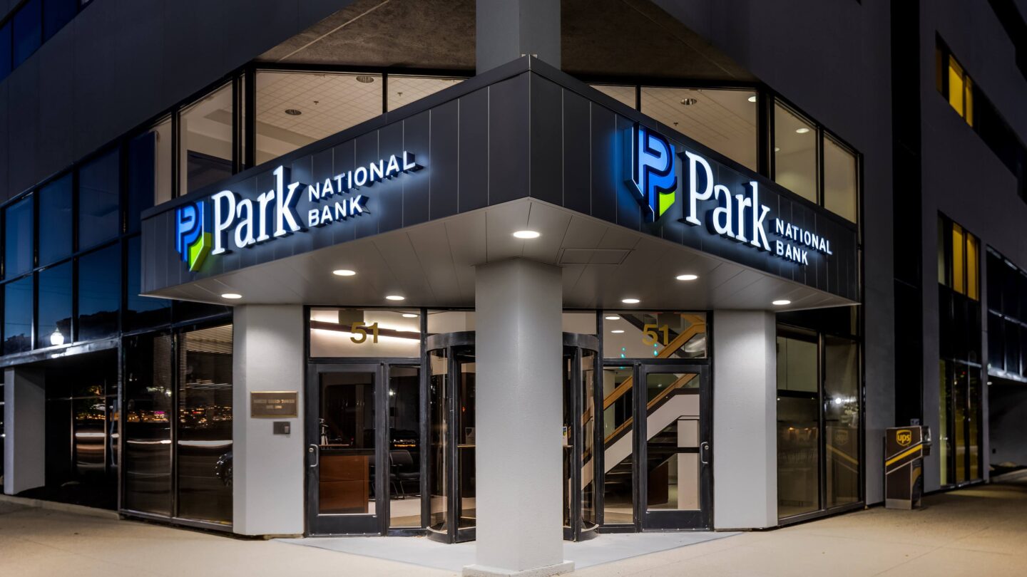
Park National Bank, Cincinnati, Ohio
Park National Bank, Cincinnati, Ohio
Park National Bank, Cincinnati, Ohio
Park National Bank, Cincinnati, Ohio
Customized market studies found 89% of prospects prefer a national or statewide bank with some local community commitment – yet the majority didn’t realize their local division of Park was already that type of bank. Individualized survey data demonstrated what customers loved about Park was not necessarily so much the brand itself, but how they were served by it. Ultimately, research revealed that a name change would not affect where people bank, as long as the Park signature customer service stays the same.
Further, Park National Bank’s name had very good brand equity to build on. With the right structure and a refreshed identity, Park would be positioned as a more sophisticated and scaled player in the markets they serve – setting them up for success by defining and distinguishing their brand, embracing new market opportunities and capitalizing on the “Network Effect” to increase branch deposits.
Park National Bank, Crestline, Ohio
Park National Bank, Crestline, Ohio
Park National Bank, Crestline, Ohio
Park National Bank, Crestline, Ohio
Unifying Identity
Adrenaline’s efforts for developing Park’s identity were keenly focused on updating and unifying the brand under one umbrella. With a spotlight on personalized service and relationship banking, the powerful new positioning captured the brands’ shared values: Where You Mean More. To customers it read as access to a full-range of resources without taking away the value of the one-to-one relationship they had with their local bank. Most importantly, it was authentic to the genuine way Park lives their values every day.
Translated into a creative strategy, Adrenaline’s design ensured the brand visually represents the idea of serving more. With the crest that’s proud and protective, the visual representation is both distinctive and relatable. The P stands for people and the shape represents three groups working together – employees, customers, community – and symbolizes their identity and legacy. The color story incorporates a modernized version of the Park blue with additional green accents. The end result is a brand beacon where Park serves more, generations meet and the community gathers and grows.
For the brand rollout, Adrenaline and Park worked in-tandem on coordinating and communicating with the affiliate banks, their associates and their customers. Adrenaline developed, managed and implemented a large multi-state training roadshow to educate and empower associates across Ohio, North Carolina, South Carolina and Kentucky. This huge undertaking in a very short timeframe resulted in Park’s people who were primed and ready for the new brand to launch across the network.
Local Adaptation
The updated Park brand provided the foundation for optimizing the customer experience across the entire organization – from the brand to the branch. With a strong internal strategy and customized communications plan for launch, Park was able to generate genuine support and readiness for this wide-scale organizational change, a crucial concern for bank executives. Migrating 12 sub-brands under one parent umbrella would mean aligning branch rebranding investment with market opportunity to inform implementation tiers.
Park National Bank, Greenville, South Carolina
Park National Bank, Greenville, South Carolina
Park National Bank, Greenville, South Carolina
Park National Bank, Greenville, South Carolina
With formats focusing on specific experiences for retail, commercial and wealth management, Adrenaline’s environments team developed a strategic phasing plan for how brand elements would be rolled out at the branch. Conversion of the branch experience was critical and complicated, especially with no previous brand standardization and varying levels of maintenance. Developing an organizational path for implementation, the team leveraged a real-time communication portal for branch updates and approvals, making coordination with so many stakeholders possible.
Leaning on a clean sweep of prior merchandising, each branch would have a fresh start to which a kit-of-parts could then be applied. Message deployment and digital signage ensured a consistent brand voice within the space. A focal wall and strategic use of the signature blue reestablished the new unified brand at the center of the customer journey.
Legacy and Opportunity
Park National Bank is now a powerfully unified financial services brand ready to capitalize on marketing opportunities and drive real return on investment – not only in advertising and sponsorships, but also in local communities and online channels. Uniting under a singular brand banner has empowered Park to capitalize on the “Network Effect” to increase deposits and create a critical mass in all of the bank’s markets.
The unified brand can also more successfully leverage digital technology and data to scale the one-to-one relationship value the brand is known for. With the heart of community banking squarely at the center of their organization, Park can now capitalize on the collective power of their brand as they support a hands-on approach to service and hard work that makes a positive impact in their communities.