For nearly 75 years, Santa Clara County Federal Credit Union has been dedicated to bringing better, more accessible banking to people in the Bay Area. While continuing to proudly support the financial needs of active or retired county employees, the credit union has grown into new markets and serves even more people today. As they opened membership beyond county employees, their legacy name no longer reflected all the people they supported or their holistic mission to serve their communities.
The credit union leadership team sought a unifying, bold brand that could carry the organization forward, honoring their strong local ties while signaling an evolution into a more modern, community-centered financial institution. The goal was as strategic as it was symbolic, removing the restrictions of a limiting name to create a more inclusive brand that invited everyone in. The outcome of that vision is Mirastar Federal Credit Union.
The Solution:
Driven by their goal of making a difference in people’s lives, the new Mirastar brand represents a bright new day for the credit union and their members to all rise together. Partnering with Adrenaline, the beloved financial institution created a brand that embodies purpose from their name to their network. The new Mirastar name better encompasses what has always been at the heart of the credit union – building stronger communities and helping each member reach their fullest potential.
We’re welcoming more people looking to build a prosperous life. Our updated brand signals a bright new day not only for our credit union, but for all of our members and the communities we serve.”
– Rebecca Reynolds Lytle, President & CEO, Mirastar Federal Credit Union
The process began with naming – a journey that resulted in a name that felt both meaningful and ownable – and carried that mission through bringing the brand to life in the branch. The Mirastar name is rich with meaning. “Mira” translates across multiple languages to words like wondrous and admirable, and in Spanish it means “to look.” Paired with star, the name becomes a poetic invitation to “look to the stars.” Even more, “Mira” is the name of an actual star – a visible point in the night sky that serves as a shared symbol of the future.
The Story:
With Mirastar, the concept of rising became the foundation for the brand story – with a perspective that stands for possibility, positivity, and presence. The brand brings clarity and unity to the organization’s purpose, telling the story of a credit union brand dedicated to helping everyone rise.
The credit union’s leaders viewed the rebrand as a rich opportunity to tell an authentic story about who they had become and who they remain committed to serve.
In the brand’s visual expression, the new identity pairs a modern coastal palette and expressive pattern with approachable human imagery that reflects Mirastar’s purpose: to uplift members, build stronger communities, and create inclusive prosperity for all.
The central star in the logo symbolizes guidance and aspiration as the four arrows point in the cardinal directions, representing diverse paths members take toward their dreams. Blending visual elements with the fonts and colors creates a bold, rich visual identity that captures Mirastar’s spirit.
Beyond brand design, Adrenaline translated the new identity into the physical branch experience through a full network refresh. In total, seven branches, headquarters, and eight remote ATMs were updated, including new signage, flooring, millwork, finishes, and renewed merchandising.
Each environment was customized to balance form and function – creating spaces that reflect vibrant local communities and deliver meaningful member experiences.
With an expansive workflow, Adrenaline’s work included brand strategy, naming, identity and design system, brand launch, and branch design and conversion. The brand activation included brand workshops, launch support, and marketing and advertising counsel.
Across the organization, the new Mirastar brand reignited unity and pride. Employees saw themselves in a brand that honors service and celebrates diversity. Members recognized a familiar partner stepping confidently into the future. And through every phase – from concept to creation to conversion – Adrenaline was there to ensure each design decision aligned with the credit union’s purpose and promise.
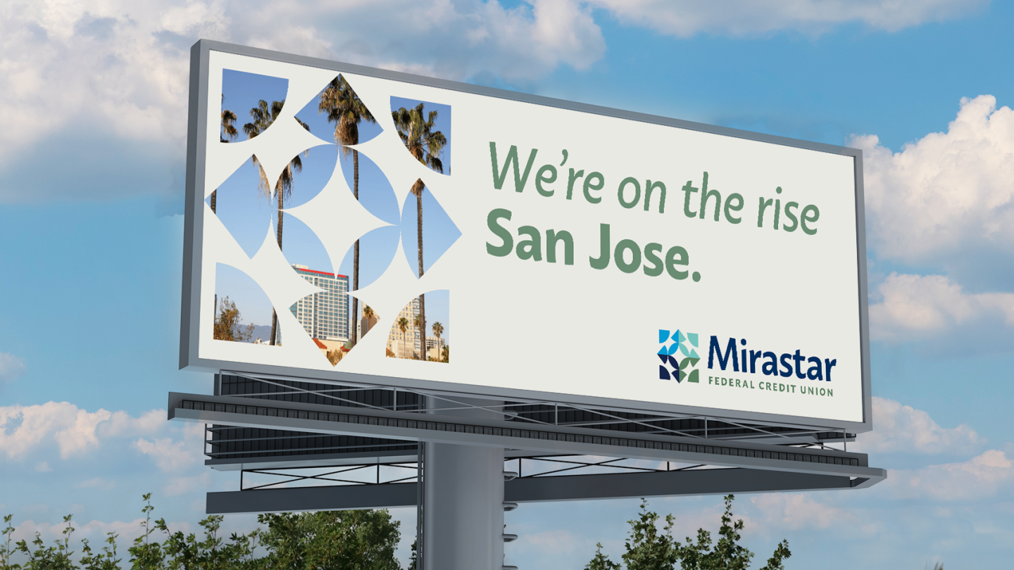
Building on the success of the rebrand, Adrenaline continues to partner with Mirastar. From upcoming branch projects to ongoing brand initiatives including community impact reports, brand workshops, and billboard campaigns, the collaboration reflects a shared commitment to the brand that endures long after launch.
Today, Mirastar Federal Credit Union stands as a symbol of transformation and trust – proof that when a brand evolves with authenticity, it becomes more than a name. The brand has become a reflection of the people it serves and the future they’re building together.