For more than 70 years, CFCU Community Credit Union has been a trusted financial partner across the Finger Lakes region, an institution known for its deep community roots, long-standing university affiliations, and consistent member service. Founded in 1953 with ties to Cornell University, the credit union grew steadily beyond its original footprint and audience. Over time, the meaning of the CFCU name became increasingly unclear, internally and externally, and the brand no longer conveyed a cohesive story. As the credit union continues to evolve, that lack of clarity would limit member and employee loyalty and institutional growth.
To build more meaning, CFCU turned to Adrenaline with a clear mandate: develop a brand and branch experience that honors the credit union’s legacy while positioning for meaningful engagement and future growth. The updated brand platform needed to be rooted in research, embraced internally, resonant with members, and flexible enough to support both near-term implementation and long-term expansion. Most importantly, the brand needed to tell a story people could understand, believe in, and see themselves in – a brand that would ultimately become Beginnings Credit Union.
The Solution:
Adrenaline approached the engagement with CFCU as a holistic transformation rather than a singular project or visual refresh. The work began with research and discovery to clarify current perceptions of the existing brand and identify opportunities to better articulate the credit union’s value and role in members’ lives. The process made clear the credit union needed a more distinctive, flexible, and ownable identity that’s capable of supporting growth while remaining rooted in trust.
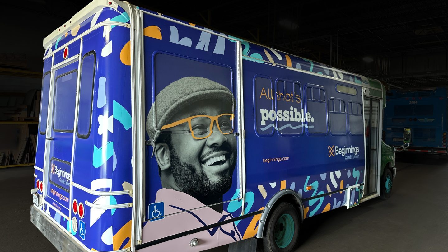
Beginnings Credit Union is a new name and brand platform grounded in the idea that every financial journey starts somewhere. Paired with the positioning, “Connecting Possibilities,” the brand establishes a clear expression of purpose that honors the credit union’s legacy while creating room to grow. The identity system is designed to be expressive yet disciplined, using a vibrant color palette, flexible imagery, and adaptable visual elements that resonate with younger audiences while remaining inclusive and relevant across generations.
“As we grow and evolve, our refreshed brand and new name give us a stronger voice to share our story and connect possibilities for our members and future generations.”
– Blixy Taetzsch, Chair of the Board, Beginnings Credit Union
Together, the visual and verbal systems allow the brand to show up confidently across member marketing, internal culture, and the branch environment. To deploy the new brand across the branch network, Adrenaline developed a kit-of-parts strategy with a scalable family of signs and environmental treatments. The approach allows branches to evolve economically, while maintaining consistency across locations. Creating a unified framework, the brand-to-branch solutions bring cohesion and momentum to the organization, employees, members, and the communities they are proud to serve.
The Story:
For Beginnings Credit Union, the rebrand represents far more than a new name or logo. The brand serves as a shared articulation of who the organization is and where it is headed, grounding future growth in purpose rather than products. From the outset, leadership viewed the work as a strategic investment designed to strengthen culture, clarify the member experience, and create consistency across every touchpoint.
“The strategy behind this effort ensured that every decision, from research to design to delivery, reinforced our commitment to serving our communities with informed authenticity to meet our members’ needs no matter where they are in their journey.”
– Lisa Whitaker, President and CEO, Beginnings Credit Union
The rebranding process was intentionally inclusive and strategic. Appealing to Gen Z was a core priority, as the credit union focused on future growth, but importantly, the brand needed to also speak across generations and welcome in all members. Beginnings brand design and aesthetic feels fresh and modern, while remaining relatable to long-standing members and the communities the credit union serves.
Member and market research, naming exploration, and testing engaged employees, members, and the broader market to ensure decisions would be influenced by the people the credit union serves every day. This approach builds consensus across the organization and reinforces confidence that the new identity is not only distinctive, but authentic.
“Being a part of the rebranding process from start to finish was an incredible opportunity to help shape a new identity that truly reflects our shared values and long-term vision.”
– Michelle Miner, Vice Chair of the Board, Beginnings Credit Union
A brand ambassador program brought employees into the process early, building understanding and advocacy ahead of launch. At the same time, a teaser campaign introduced the Beginnings name to members prior to Legal Day One, allowing the credit union to maintain marketing momentum while guiding members and the market through the transition.
“As board members, our responsibility has always been to maintain a strategic vision that ensures we are serving our members in the best possible way. Participating in the rebrand process allowed us to listen closely to the voices of our staff, members, and the communities we proudly serve.”
– Amy Wood Gonzales, Board Member, Beginnings Credit Union
Internally, the Beginnings brand has quickly become a source of pride. Employees embrace the new identity as a clear reflection of their culture, values, and commitment to service. The structured launch and internal communications create shared ownership and help teams confidently bring the brand to life across marketing, branches, and daily interactions.
“The rebrand has been a thoughtful, collaborative process that aligned strategy with execution across every department. Staff embraced the change with enthusiasm, and from the outside members and community partners have responded with excitement.”
– Bill Crane, Chief Production Officer, Beginnings Credit Union
That enthusiasm carries directly into the branch environment. Through targeted refreshes, environmental graphics, and carefully placed brand moments, Beginnings’ physical spaces reflect the same optimism and clarity as the brand itself.
Rather than overwhelming members with change, the experience reinforces familiarity while signaling progress, supporting both current operations and future evolution.
Environmental branding plays a large role bringing the brand to life within the branch, drawing upon the brand’s bold color palette and pattern treatments, and using relatable imagery of Gen Z members achieving their financial goals.
As the brand came to life internally, the branch network became a critical proving ground. Rather than pursuing full-scale renovations, Beginnings and Adrenaline focused on a practical, repeatable approach that allowed the brand to show up clearly and consistently across locations without disrupting operations.
Through individual branch assessment, strategic use of interior paint, environmental branding, and a modular kit of parts, even modest interventions delivered outsized impact.
Leadership and staff quickly saw how a disciplined system, when applied thoughtfully, could transform the look and feel of each space, reinforcing the brand while allowing branches to embrace change at their own pace.
By rooting the transformation in research, collaboration, and discipline, the organization has a system that honors its past while opening the door to what comes next. In every sense of the word, Beginnings now has a brand platform and branch experience designed to meet members where they are and help them move forward – with all that’s possible.
“Our rebrand is more than a new look, it’s a reflection of the values and vision that have guided us for decades, while positioning us to meet the evolving needs of our members.”
– Lisa Whitaker, President and CEO, Beginnings Credit Union