When Merrimack Valley Credit Union, Bridgewater Credit Union, and RTN Credit Union merged, three strong legacies would need to be united to form a singular force in regional banking and capitalize on combined scale to compete in crowded banking markets in Massachusetts, New Hampshire, and Rhode Island. With deep local ties and an eye on the future, the leadership team of the newly merged organization recognized the pressing need for a single cohesive brand to replace three overlapping and often confusing identities still in the marketplace.
Beyond name recognition, the credit union needed an ownable name and brand that could connect three distinct cultures, energize employees, foster member loyalty, and provide a platform for growth. To fully realize the new brand for members and communities, all 29 branches would also require a coordinated conversion. The launch of BrightBridge Credit Union would mark a defining moment for the financial institution – transforming three separate identities into a singular optimistic brand with the power to unify people and purpose.
The name BrightBridge embodies our dedication to supporting our members through life’s biggest milestones and challenges.”
– John J. Howard, President & CEO, BrightBridge Credit Union
The Solution:
Emerging from the complex merger, the credit union had a bold ambition – to unify under one brand that could honor a collective past, reflect a powerful purpose, and propel future growth. To successfully bring together three institutions, three cultures, and three legacy brands under one banner, the credit union partnered with Adrenaline to lead a comprehensive and collaborative rebrand that would be grounded in research and driven by strategy. The new BrightBridge Credit Union brand is fueled by people-first values and connected by a vision of a bright future.
From naming and strategy to visual system and voice, the BrightBridge brand is direct and dynamic, capturing the organization’s optimism while remaining rooted in their rich community values. Designed for internal cohesion and external impact, the BrightBridge brand launched across their full network of 29 branches, a headquarters location, and multiple workplaces, supported by a coordinated conversion process. The result is a brand built to connect, inspire and grow, laying a strong foundation for the next chapter in the credit union’s story.
The Story:
From the earliest engagements, the brand work behind BrightBridge Credit Union was centered around more than just the creation of a new name. The process was guided by making meaning for members, with a brand that could unite people, reflect shared values, and convey the optimism of an organization focused on the future.
To bring that vision to life, the credit union undertook a comprehensive rebranding program that included market, member, and employee research; brand design and experience strategy; naming and identity development; board engagement and presentations; a scalable design system; and a coordinated brand launch.
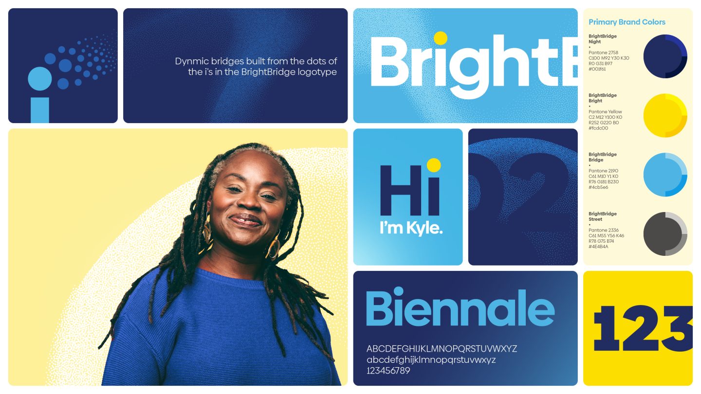
The BrightBridge brand was shaped through collaboration with leadership, internal teams, and external partners, building alignment from the inside-out. The name BrightBridge was carefully chosen to express the credit union’s role as a connector – between people and possibility, legacy and innovation, and employees and members.
With brand principles that are direct, dynamic, and down-to-earth, the credit union centers real people and places. The BrightBridge brand story offers a fresh approach built on the belief that the credit union serves their members and communities best by connecting people with financial opportunities that power a better, brighter future.
From voice and identity to signage and space, every element of the brand was crafted to reflect the credit union’s values, resulting in a brand experience that feels modern, meaningful, and made for community.
On the branch side, the BrightBridge rebrand was brought to life through a comprehensive branch conversion that translated the soul of the new brand into the built environment.
To reflect the new identity in each space, Adrenaline developed a comprehensive exterior family of signs and an interior kit of parts that aligned with brand guidelines.
The effort demanded both flexibility and focus in an evolving environment, as decision-makers weighed in. Adrenaline navigated stakeholder engagement with a collaborative, solution-oriented approach to ensure alignment without compromising timelines.
Each branch was addressed with a tailored design strategy deck detailing recommended brand elements, finishes, furnishings, millwork, and merchandising. The Adrenaline team also offered guidance for digital screen placement to enhance visibility and flow, ensuring each space was optimized for both experience and expression.
The BrightBridge brand launch has not only created a unified brand and brought a wow factor to our branches across the footprint, it has also inspired and energized our employees.”
Energized by an internal launch that centered employees in the brand story, the unified organization now stands as a platform for building belonging. Through the branch and brand experience, BrightBridge delivers impact that helps members navigate life’s biggest financial moments with confidence and optimism.