The Billboard Effect & the Power of the Branch
A conversation about how powerful design transforms the branch into a brand beacon
The Billboard Effect at a Glance:
- The branch functions as a visible brand presence within the community as branch design expands brand expression from the inside out
- Layered brand elements such as color, lighting, and iconography generate impact even with construction constraints
- A cohesive design language across branch networks builds recognition and relationships, leading to long-term growth
Retail research continues to reinforce a simple yet powerful truth: physical presence drives engagement. More than perceived convenience, retail locations function as powerful brand billboards that draw people in and generate greater growth simply by a brand being present in a market. Contrary to the belief that online sales will become the primary driver in the consumer marketplace, Forrester projects that a staggering 72% of total U.S. retail sales will still happen in physical stores through at least 2028, underscoring the ongoing importance of real-world visibility.
Just like in the retail sector, branch locations in banking drive the lion’s share of customer acquisition, with branches accounting for 72% of new accounts. Even more, the relationships that begin at the branch are more durable and profitable than those that are initiated online. The branch is not just a service point but a living, always-on extension of the brand – shaping perception, signaling trust and counsel, and influencing consumer choice long before someone steps inside. The branch is the most visible, tangible expression of the brand in the community, and when designed intentionally, the branch becomes a billboard that projects outward.
To discuss the role of branch design in creating the billboard effect, Amanda Pouliot and Monique Rodrigues, Adrenaline’s Design Directors, address how financial institutions can leverage their branches to extend brand visibility beyond signage. Together, they bring deep experience translating brand strategy into physical space. Their perspectives move beyond signage and wayfinding to explore how branch design and brand expression work together to create connections and drive growth – transforming the branch into a true brand beacon.
What is the “Billboard Effect” in branch banking?
Amanda: At its core, the billboard effect is about extending your brand beyond the logo on the building. It’s breaking down the barriers between the institution and the community it serves. We hear clients say they want to feel welcoming, warm, and inviting. That starts with how the building engages the street. When we design from the ground up, we look at expansive glass and natural sightlines to blur the line between where the community ends and the bank begins. That transparency creates an open invitation. It allows branding moments inside the space to project outward, especially at night, creating a more dynamic and memorable impression.
Monique: Historically, signage was about wayfinding. Buildings were designed to fit into the surrounding architecture, and the sign simply told you where you were. Now we think differently. The building itself becomes the beacon. It’s not just fitting in; it’s leveraging architecture to invite people in. The branch becomes a physical brand extension rather than just a transactional space.
How is this different from traditional signage or merchandising?
Amanda: Any institution can put posters in the window promoting rates. That information is useful, but it’s not differentiated. It’s often the same information customers can find online. The branch is an opportunity to drive curiosity. When you take a more artful approach – like using movement, color, or bold brand expression – you catch attention first. That curiosity leads people to ask, “What is this? What kind of institution is this?” Once you’ve captured their attention, then the hierarchy of messaging can follow.
Monique: And context matters. In urban markets, bold digital expression feels appropriate. In other markets, you might approach it differently. Flagship locations may leverage more dynamic elements, while standard retail branches balance cost and environmental fit. But the goal remains the same: visibility and differentiation.
What if an institution doesn’t have prime real estate or large expanses of glass?
Monique: There are always opportunities, even within constraints. We start by assessing the existing architecture. Is there something unique you can expand upon? Are you maximizing what you already have?
From there, we look at several levers:
- Curated master building signage
- Creative use of iconography rather than just the full logo
- Strategic use of brand color signals through materials or window graphics
- Exterior illumination to increase visibility
- Lobby projection and digital moments where possible
It’s rarely one singular move. It’s layering elements together.
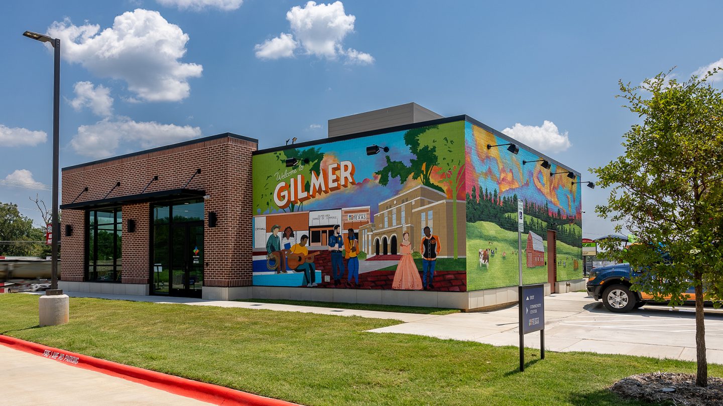
Amanda: Retailers do this extremely well. Think about storefront displays at brands like Nike or Starbucks. Financial institutions historically haven’t leveraged their windows in that way. But even without ideal glass conditions, you can introduce facade treatments, lighting, architectural features – all of which become ownable and brand-defining.
How does the Billboard Effect work in acquisition-heavy branch networks?
Monique: This is where it gets interesting. Many institutions grow through acquisition, inheriting every architectural style imaginable. That can feel like a limitation. Instead of looking for one silver bullet, we build a cohesive design language that can transcend different building types. We identify a family of elements that work within existing conditions – signage, color mitigation, lighting, architectural accents – and apply them strategically. It becomes about creating landmarks within each community. Even across varied architecture, customers begin to recognize consistent brand signals.
Amanda: You don’t want to hide within your community. Customers and members choose institutions that feel visible and convenient. The branch is still the best billboard you have — and perception drives growth.
Why does alignment between brand and physical space matter so much?
Amanda: You notice when it’s not aligned. When a space feels disconnected from what you know about a brand, there’s friction. It feels temporary or generic. When it’s aligned, you may not consciously notice it, but it feels intuitive. It feels right.
Monique: The goal is a tangible representation of the brand’s image and values within the community. Architecture, retail windows, interior design – they all work together to create visibility and an inviting presence. That’s the Billboard Effect. It’s not just signage. It’s the physical embodiment of the brand.
From architectural expression to exterior visibility strategy, Adrenaline helps banks and credit unions transform their branch network into a powerful brand asset, turning physical presence into measurable growth through the branch channel.
Adrenaline is an end-to-end brand experience company serving the financial industry. We move brands and businesses ahead by delivering on every aspect of their experience across digital and physical channels, from strategy through implementation. Our multi-disciplinary team works with leadership to advise on purpose, position, culture, and retail growth strategies. We create brands people love and engage audiences from employees to customers with story-led design and insights-driven marketing; and we design and build transformative brand experiences across branch networks, leading the construction and implementation of physical spaces that drive business advantage and make the brand experience real.